Quality Teacher Talk

In this typically engaging short video piece from Hans Rosling, the world-renowned data visualisation and data-entertainment guru (see his brilliant TED Talks for more), identifies the power of explaining using props. He emphasises that although video can be used to explain some concepts, (see Ted-ED for examples to use if you’re looking to implement some flipped learning in your lessons), nothing replaces the teacher and their ability   to make learning fun through the explanations they can offer. For teachers and presenters alike,  being able to draw upon a vast repertoire of explaining is fundamental to being able to meet the needs of all learners/ listeners. As a result, there’s a great opportunity to keep refreshing ‘explaining techniques’ and consider the many ways we can employ quality teacher talk to differentiate, challenge and encourage learners to understand new concepts and think in new ways.


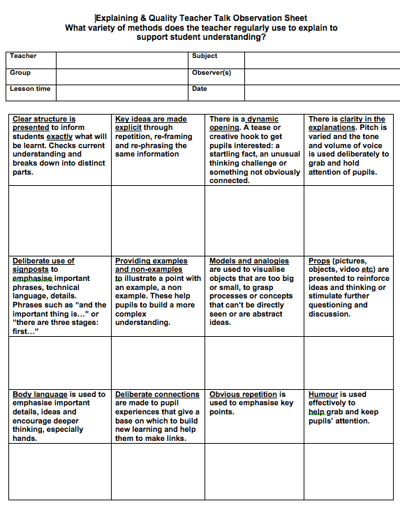
I’ve included a screen shot of an observation format I use very regularly for you to have a look at: ‘Explaining – Improving the Quality of Teacher Talk’  The original version plus others that I regularly use, adapt and tweak can be found in “Full On Learning”. You’ll notice that this is a very focused observation tool, as it ONLY looks at the quality of teacher talk in relation to EXPLAINING. Hence it can be used as part of a developmental coaching approach..which is just how I use it.

I use this particular one as part of my pedagogical coaching toolkit. I’ve got others that focus on questioning and a more generic one that looks ONLY at ‘Pupil activity during the lesson’. They’re all developmental in design as they are limited by their focus on a very specific element of pedagogy. In practice, they work as a simple tally sheet during the lesson. You can add additional layers of complexity, according to what the teacher wants to focus on, but my watchword is and always has been to keep it SIMPLE when it comes to observing the complicated world of teaching and the similarly complex world of learning.

The strength of this tool is:

1. When you work with a group of teachers to create and amend the observation format you get into wonderful discussions and sharing of expertise. In fact, it’s at THIS point when you get the really crunchy discussions about ‘quality teacher talk’ and how various concepts can be explained and what else could be used to aid the communication of complexity, of topic fundamentals and of core concepts so that learner understanding is secure.

2. When used as part of a pedagogical coaching programme, the results can be put into a simple spreadsheet to generate a visual chart (Hans Rosling would be proud!). This then forms the basis of your coaching discussion, as it places the focus of the discussion on the teacher, enabling them to reflect and consider their own practice.

3. Coupled with a skilled coach possibly also with video, you get rewarded by by using this as part of a MARGINAL LEARNING GAINS approach and find that you get those sought-after MULTIPLE GAINS from one simple pedagogical focus.

Teacher Explanations and the Quality of Teacher Talk

Teacher Explanations and the Quality of Teacher


Enhancing the flow of learning through ‘Phased Disclosure’

(https://foursquare.com/sachab/list/northern-line)

Those of you who know me will know what a hopelessly visual-biased learner I am.  I adore the way we can communicate complex ideas in a multi-layered way through a simple illustration, shape or diagram. The popularity of info-graphics and data visualisations reflect an increased interest in communicating ideas and messages in an easily accessible format.  More on this in a post to follow, but visual representations or pictorial short-hand are by no means new or unfamiliar.

I was watching the BBC documentary series ‘The Tube’ recently and episode 5 included a great piece on the work of Paul Marchant who is Head of Product Design at Transport for London.  He gave a fascinating explanation of how the signage throughout the whole London Underground system is designed.  The signs are deliberately designed so as to give just the right amount of information at the right time as you travel through the system to get to the right train.  Not only that, but the information is deliberately designed according to the best distance to be able to read it, so the size of the lettering (the ‘X heights’) is meticulously calculated to give people enough time to read the information whilst still keeping them flowing through the system.

In his piece to camera, he explained that without the signage, the commuter wouldn’t be able to make their individual decisions at the specific point that they needed which would result in an interruption to the flow of the system, which would then start to back up.  The signage enables the system to work more efficiently.”People think this just happens…” he said, but the process that underpins how to increase the efficiency in the flow of commuters through the system is very deliberate indeed.  As you would expect, this made me think about learning design…

He used a great phrase for the design principles he uses, “Phased Disclosure”.

It made me think that if we were to apply theses same principles to how we deisgn learning, I wonder if we could increase the flow of learning in lessons?

So here’s an enquiry question: “How do I increase the flow, and therefore quality of learning through my lesson design?”

And my initial thoughts on what success could look like…

1. More opportunities for quality reflection and reduction of interruptions (by teacher and learner)

2. Greater autonomy for learners to make choices (select from the 4 T’s of Autonomy: TEAM: who they work with; TIME: when they get the work done, TECHNIQUE: how they work and TOPIC: what they work on) that will lead to an increase in choices offered and improved decision-making

3. Higher levels of sustained engagement by all learners, working at their own pace and leading their own learning

I’ve had a first go and aligning the ‘flow’ of a commuter through the underground system that Paul Marchant explained to the flow of learning.  I’d be interested to hear what you think:

(1) ALL OPTIONS DISPLAYED: Go through the gate line – graphic representations of all possible travel options that are available to you (BIG PICTURE & the WHY, HOW and WHAT of learning*)

*See Simon Sinek’s great TEDx Talk about this model and his website and book “Start with the Why?”

(2) DECISION MAKING POINT: colour coded, suspended signs indicate the route to follow for the desired choice of tube line (AUTONOMY & INDEPENDENCE: 4 T’s of CHOICES: TIME, TECHNIQUE, TEAM, TOPIC*)

*Daniel Pink talks about the ‘Four T’s’ in his brilliant TED Talk (also well worth a watch in animated form in the RSA Animate series) and he has written about motivation in “Drive”

(3) REASSURANCE: as you move down the escalator, there are larger suspended signs that everybody moving down the escalator can read as they descend towards the platforms. These reinforce the information you already have and reassure you that they you moving in the right direction (QUESTIONING & FEEDBACK: LEARNER-TO-TEACHER)

(4) DECISION MAKING POINT: colour coded again and suspended, these provide you with options of northbound or southbound pltaforms (REFLECTION & RESILIENCE: PROGRESS & INTELLECTUAL RISK-TAKING)

(5) BIG PICTURE: as you walk onto your platform, you can check that you are heading the right way for this part of your journey by looking at large static ‘maps’ of the tube route on your desired line, in the direction you have opted. (REFLECTION, ADAPTATION, AMENDMENT & SUCCESS CRITERIA)

This is all very early days in my thinking, but I wonder if this gives us another way to look at how and why) we need to personalise and differentiate?

Perhaps we should be thinking about learning as ‘phased disclosure’? But exactly who gets to do the disclosure is the next challenge…